
Introduction
Web development is about more than just making pretty websites. It’s about crafting digital experiences that people can trust, use easily, and actually enjoy – no matter what device or platform they’re on. Whether you’re just dipping your toes into the world of web dev or you’re looking to sharpen your skills, being well-versed with web development best practices can really set you apart in this fast-moving field.
Think of these best practices as your web development toolkit. They’re the tried-and-true techniques that can help you build faster, more user-friendly sites and keep you ahead of the curve.
In this guide, we’ll walk you through the top 11 practices that every modern website should follow. We’re talking about the stuff that boosts performance, makes users happy, and sets you up for long-term success.
1. Prioritize Mobile-First Design

Why Mobile-First Matters
With mobile traffic accounting for more than 55% of global web visits, focusing on mobile-first design has become crucial. When you design with mobile users in mind first, you ensure that your website is accessible and functional on the devices most people are using.
Mobile-first design also helps reduce unnecessary elements from your desktop site, as it forces you to focus on core content and functionality. As you scale up from mobile to larger screens, the experience becomes naturally richer and more engaging.
Key Mobile-First Design Principles
- Responsive Grids and Flexible Images: Use responsive layouts that adjust fluidly across different screen sizes. Flexbox and CSS Grid systems are great tools for creating dynamic and flexible layouts that respond to various screen sizes.
- Touch-Friendly Design: Designing for touch screens means larger buttons, simplified forms, and easy-to-tap navigation. Avoid small clickable areas that are hard to use with fingers—aim for buttons that are at least 48px in height and width.
- Optimized Performance: Mobile users often face slower connections, so ensuring fast load times on mobile is key. Prioritize loading essential elements first, lazy load images, and minimize the use of heavy scripts and videos on mobile versions of your site.
2. Optimize Website Speed
Why Speed is Crucial
A slow website can drive visitors away within seconds. Studies show that users expect a website to load in under three seconds, and even a one-second delay can lead to a 7% reduction in conversions. Beyond user experience, website speed is also a critical factor for SEO. Google uses page speed as one of its ranking signals, meaning faster sites often rank higher in search results.
Key Strategies to Improve Speed
- Image Compression: High-quality images are often the main culprits behind slow load times. Compress your images using tools like TinyPNG or Squoosh to reduce their file sizes without sacrificing quality. For larger image sets, consider automating compression using build tools like Gulp or Webpack.
- User Modern Media Formats: Consider using modern web-friendly media formats like WebP, WebM, etc., which offer superior quality at smaller sizes than traditional formats like JPEG, GIF, etc. Tools like ImageMagick, ImageOptim and Optimage allow batch conversion of legacy file-types to modern formats.
- Minify CSS, HTML, and JavaScript: Minification removes unnecessary spaces, comments, and characters from your code, making it more efficient. Tools like CSSNano for CSS and UglifyJS for JavaScript are excellent for automating this process.
- Leverage Browser Caching: Browser caching stores certain files (such as images, CSS, and JavaScript files) on the user’s local device so they don’t have to be re-downloaded every time the user visits your site. You can set caching rules via your server configuration or use caching plugins like W3 Total Cache or LiteSpeed Cache.
- Reduce HTTP Requests: Each element on your website (images, CSS files, JavaScript files, etc.) requires an HTTP request. Minimizing these requests can drastically improve load time. Use tools like Pingdom to analyze your site’s request count and look for ways to reduce it—such as combining CSS/JS files or using image sprites.
3. Implement SEO Best Practices
On-Page SEO Essentials
Search Engine Optimization (SEO) is vital for ensuring your website can be found by users. While SEO can seem daunting, following a few key best practices can dramatically improve your site’s visibility.
- Title Tags and Meta Descriptions: Craft clear, concise title tags and meta descriptions for each page. These elements tell both users and search engines what your page is about. Ensure that your focus keyphrase appears in both.
- Heading Hierarchy: Structure your content using a logical hierarchy of headings (H1, H2, H3, etc.). This not only improves readability for users but also helps search engines understand the structure of your content.
- Alt Text for Images: Search engines can’t “see” images, so including descriptive alt text for every image helps them understand what’s in the image and how it relates to your content. Alt text also improves accessibility for users with visual impairments.
- Internal and External Links: Use internal links to help users navigate between relevant pages on your site, and include outbound links to authoritative external resources. This helps search engines better understand the context and credibility of your content.
Structure Your URLs
Keep URLs short, descriptive, and user-friendly. Avoid including unnecessary characters or dynamic strings. For example, a URL like /web-development-best-practices is clearer and more SEO-friendly than /id=1249?name=post.
Importance of Schema Markup
Schema markup is a type of code that helps search engines better understand your content, making it easier to deliver rich results like featured snippets or knowledge panels. Adding structured data improves your site’s chances of being highlighted in search results. Google’s Structured Data Markup Helper is a great tool for implementing schema on your website.
The Complete Beginner’s Guide to WordPress SEO
4. Ensure Cross-Browser Compatibility

What is Cross-Browser Compatibility?
Cross-browser compatibility involves designing and developing a website to ensure it operates uniformly across various web browsers like Chrome, Firefox, Safari, and Edge. Each browser has its unique way of interpreting HTML, CSS, and JavaScript, which can lead to differences in how a website is displayed or functions. Therefore, thorough testing across these platforms is crucial to guarantee a consistent user experience for all visitors.
Key Browsers for Compatibility Testing
While there are many browsers on the market, developers should prioritize:
- Google Chrome (Blink engine)
- Mozilla Firefox (Gecko engine)
- Safari (WebKit engine)
- Microsoft Edge (has transitioned to the Blink engine but can behave differently due to its unique features and legacy support)
Although other browsers like Opera and older versions of Edge used different engines, modern versions of Edge now use Blink, similar to Chrome. Thus, ensuring compatibility with Chrome, Firefox, and Safari often covers a broad spectrum of other browsers due to shared or similar rendering engines.
Strategies for Testing Cross-Browser Compatibility
- Automated Testing Tools: Utilize services like BrowserStack, Sauce Labs, or LambdaTest. These tools offer environments to test how your website performs across different browsers, versions, and devices without needing multiple physical setups.
- Manual Testing: Sometimes, there’s no substitute for manually checking your website in different browsers to catch aesthetic or functional anomalies that automated tests might miss.
- Progressive Enhancement: Begin with a core functional experience that works universally. Then, enhance this base with advanced features supported by newer or more capable browsers. This ensures that all users get a usable site, with added functionalities for those with more modern browsers.
- Responsive Design Principles: Implement CSS media queries and flexible grid layouts to ensure your site adapts not just to different browsers but also to various screen sizes and devices.
- Feature Detection: Instead of browser detection, use feature detection with libraries like Modernizr to apply enhancements only when a browser supports specific functionalities.
5. Enhance Website Security
Why Security is Critical
Website security is one of the most critical concerns for modern websites. Cyberattacks, data breaches, and malware can damage your reputation and cause users to lose trust in your site. Google even flags sites without HTTPS as “Not Secure,” which can deter visitors.
SSL Certificates are a Must
An SSL certificate encrypts the data exchanged between your server and the user’s browser. It also gives your website the coveted “HTTPS” in the URL, indicating that it’s secure. Getting an SSL certificate is easy; many web hosts offer free SSL options through Let’s Encrypt.
Security Plugins and Firewalls
For CMS platforms like WordPress, security plugins are essential. Tools like Wordfence and Sucuri provide features like firewalls, malware scanning, and real-time monitoring to protect your site from malicious attacks.
Regular Software Updates
Many security breaches happen due to outdated software. Regularly update your CMS, themes, and plugins to patch vulnerabilities. Even if you aren’t actively developing the site, keep an eye out for updates and apply them promptly.
6. Improve Website Accessibility
What is Accessibility?
Website accessibility refers to ensuring that your site is usable by people with disabilities, including those with visual, auditory, motor, or cognitive impairments. Making your website accessible not only improves user experience but also expands your audience and meets legal requirements in many regions.
Core Accessibility Features
- Alt Text and Descriptions: Use descriptive alt text for all images and links, so screen readers can accurately describe the content to visually impaired users.
- Keyboard Navigation: Ensure your website can be navigated entirely using a keyboard. Many users with mobility impairments rely on keyboard shortcuts, so all interactive elements (links, buttons, forms) must be accessible via keyboard controls.
- ARIA Labels: Accessible Rich Internet Applications (ARIA) labels help describe the purpose of web elements to assistive technologies. For instance, labeling a form field with ARIA can provide additional information to a screen reader user about what the field does.
7. Integrate Analytics

Why Monitoring is Important
Tracking user behavior and website performance is essential for making data-driven decisions. Analytics tools provide insights into how users interact with your website, allowing you to make informed improvements that enhance user experience and drive conversions.
Google Analytics
Setting up Google Analytics gives you access to a wealth of data, from user demographics and traffic sources to real-time tracking of site interactions. It’s a powerful tool for understanding where your users come from, which pages they visit, and how long they stay on your site.
Heatmap Tools
Heatmaps visualize user behavior, showing you where users are clicking, scrolling, and spending the most time. Tools like Hotjar provide heatmaps, session recordings, and conversion funnel analysis, allowing you to refine your website’s layout and improve UX.
8. Regularly Monitor Website Performance
Why Performance Monitoring is Crucial
Performance monitoring is an ongoing process that allows you to identify bottlenecks, troubleshoot issues, and ensure your website runs smoothly across devices and platforms. A well-performing website leads to better user engagement, higher search engine rankings, and, ultimately, more conversions. Slow load times or broken pages can result in high bounce rates and poor user experiences, which can significantly impact your business.
Key Metrics to Track
Effective performance monitoring involves keeping an eye on several critical metrics that directly affect user experience and SEO:
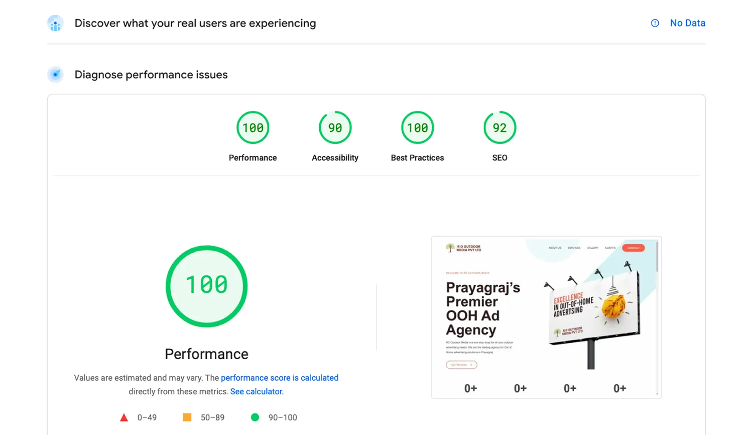
- Page Load Speed: The time it takes for a page to fully load impacts both user experience and search rankings. Google recommends keeping your page load time under 2-3 seconds. Tools like Google PageSpeed Insights and GTmetrix provide a detailed analysis of your page’s speed and offer suggestions for improvement.
- Uptime and Downtime: Ensuring your website is accessible to users 24/7 is vital. Regular downtime not only frustrates visitors but can also harm your search engine rankings. Using tools like Uptime Robot or Pingdom helps you monitor your site’s availability and sends alerts in case of issues.
- Core Web Vitals: Google’s Core Web Vitals focus on user-centric aspects of performance, such as loading, interactivity, and visual stability. These include metrics like:
- Largest Contentful Paint (LCP): Measures how quickly the main content of the page loads. Aim for under 2.5 seconds.
- First Input Delay (FID): Tracks the time it takes for the page to become interactive. A good FID score is less than 100 milliseconds.
- Cumulative Layout Shift (CLS): Measures the stability of content as it loads. An ideal CLS score is below 0.1 to avoid content shifting unexpectedly.
Tools for Performance Monitoring
- Google Analytics: Google Analytics not only tracks user behavior but also provides insights into how different pages are performing in terms of load times and bounce rates. Monitoring traffic sources, device usage, and popular pages can help you pinpoint where performance issues might lie.
- Google Search Console: This tool gives insights into your site’s search performance, identifying which pages may be slow or returning errors. It also provides alerts for indexing issues, mobile usability, and performance improvements.
- Third-Party Performance Monitoring Tools: Services like New Relic and Dynatrace offer advanced performance monitoring, tracking server response times, database queries, and third-party API performance. These tools are especially useful for complex web applications that rely on multiple components and services.
Establish a Monitoring Routine
Monitoring isn’t a one-time task. Set up automated performance checks to regularly review key metrics, especially after major updates or new content additions. Quarterly audits of your site’s performance can help you catch issues before they affect user experience or rankings.
9. Focus on User Experience (UX)
Simplified Navigation
A well-structured, intuitive navigation system is one of the most crucial aspects of web design. Visitors should be able to find what they’re looking for with minimal effort. If users can’t navigate your site easily, they are likely to leave quickly, leading to higher bounce rates and lower engagement.
To achieve effective navigation:
- Use Familiar Terms: Stick to common labels like “Home,” “About Us,” and “Contact” to reduce confusion. Avoid jargon or overly creative names for essential pages.
- Organize Logically: Structure your menus so users can predict where content is located. For large sites, using submenus under clear, parent categories improves the user journey.
A common mistake in web development is overcomplicating the navigation, which can overwhelm users. Keep it simple, and conduct regular usability testing to ensure your menu remains user-friendly.
Fast and Clear Call-to-Actions (CTAs)
CTAs drive the desired action from your visitors, whether it’s signing up for a newsletter, purchasing a product, or reading more content. Well-designed CTAs are both compelling and unmissable.
- Keep Them Simple: Use short, action-oriented phrases such as “Sign Up,” “Get Started,” or “Learn More.” Overly complex or wordy CTAs can confuse users and deter them from taking action.
- Make Them Stand Out: CTAs should be visually distinct. Use bold fonts, contrasting colors, or hover effects to draw attention. Place them in prominent areas, such as above the fold or after key content sections, ensuring they’re easy to find.
Avoid Overloading with Pop-ups
While pop-ups can be effective for capturing leads or offering promotions, excessive use can frustrate visitors. Poorly timed or intrusive pop-ups often lead to higher bounce rates.
- Use Sparingly: Limit the frequency and number of pop-ups on a single page. Consider showing pop-ups only when visitors are about to exit the site (exit-intent pop-ups) or after a certain amount of engagement.
- Ensure UX Consistency: Make sure pop-ups don’t cover essential content or disrupt the user experience. Provide clear exit options and ensure pop-ups are responsive on mobile devices.
10. Leverage Version Control Systems
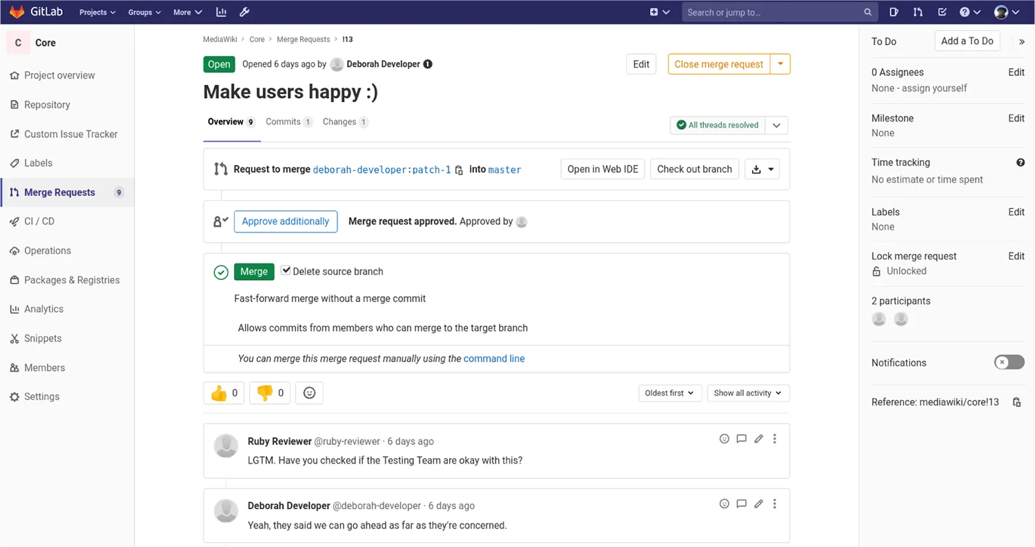
Why Version Control Matters
Version control is indispensable for web developers, especially when working in a team or managing large codebases. It allows you to track and record every change made to the website’s code, enabling you to roll back if an issue arises. It also supports collaboration by allowing multiple developers to work on the same project simultaneously without conflicts.
GitHub, Bitbucket and GitLab
Three of the most popular platforms for version control are GitHub, Bitbucket and GitLab. Both provide robust tools for managing repositories, tracking issues, and collaborating in real time.
- GitHub: As the most widely used platform, GitHub integrates easily with other development tools and provides excellent documentation. Its social features (forking, starring, pull requests) make it perfect for both private and public repositories.
- Bitbucket: Particularly useful for teams working with the Atlassian ecosystem (Jira, Trello), Bitbucket offers a more streamlined integration experience and includes free private repositories.
- GitLab: GitLab is an all-in-one DevOps platform that combines version control with CI/CD features, making it ideal for teams looking to streamline their workflows. Its robust collaboration tools, including merge requests and issue tracking, enhance team productivity while ensuring code quality. GitLab also offers flexible self-hosting options and a generous free tier for both private and public repositories.
Best Practices for Version Control
- Commit Frequently: Make regular commits with meaningful descriptions, so you can always understand the purpose of each update.
- Use Branches: Create separate branches for new features, bug fixes, or experiments. This allows you to work on updates without affecting the main codebase until the changes are ready to be merged.
11. Regularly Test and Maintain Your Website
Routine Testing
Web development doesn’t stop once a site goes live. Regular testing ensures that the website remains functional, fast, and compatible across devices and browsers. Over time, updates to browsers, operating systems, or your own site’s code can lead to unexpected issues. Testing ensures that you catch these problems early.
Here’s what you should focus on:
- Cross-Browser Compatibility: Your site should perform consistently on all major browsers—Chrome, Firefox, Safari, and Edge. Use tools like BrowserStack to test how your site renders across different environments.
- Mobile Responsiveness: With mobile traffic surpassing desktop, it’s crucial that your site looks and functions well on smartphones and tablets. Use responsive design techniques and test your site on multiple screen sizes to ensure compatibility.
- Automated Testing Tools: Platforms like Selenium and Cypress help automate repetitive testing tasks, such as checking for broken links or verifying form submissions.
Backups Are Non-Negotiable
Regular backups of your website are an essential part of ongoing maintenance. Whether you’re dealing with a security breach, accidental deletion, or server failure, having an up-to-date backup allows you to recover quickly and minimize downtime.
- Automated Backup Solutions: Plugins like UpdraftPlus and Sucuri offer reliable, scheduled backups. These tools can save backups to cloud storage solutions like Google Drive or Dropbox, ensuring your data is safely stored offsite.
- Frequency: The more often your site changes, the more frequently you should back it up. For e-commerce sites, daily backups are recommended to protect against data loss. For static sites or blogs, weekly backups may suffice.
Conclusion
By following these 10 essential web development best practices, you’ll be well-equipped to build modern, efficient, and user-friendly websites. Whether you’re a newcomer or an experienced developer, implementing these tips will help you create sites that are secure, fast, and optimized for both users and search engines.
At 6 Degrees, we specialize in creating websites that don’t just look good but perform exceptionally well. Want to improve your website’s performance or need help building a new one from scratch? Contact us today for a free consultation and let’s build a high-performing website together.