Think about branding for a moment. Color isn’t just a visual element – it’s a powerful tool that shapes how people perceive and interact with your brand. It even influences their decisions about your products or services. Choosing the right color palette for modern brands is like setting the mood and tone for a conversation before it even begins.
When done well, your brand’s colors can evoke emotions, create a lasting impression, and speak volumes without saying a word. It’s a subtle yet incredibly effective way to communicate your brand’s personality and values.
In this guide, we’ll explore the art and science of choosing the perfect color palette for your modern brand. We’ll examine color psychology, look at current design trends, discuss common pitfalls to avoid, and provide you with helpful resources for crafting your brand’s visual identity.
The Importance of Color in Modern Branding
Color as a Brand Identity Tool
Color isn’t just decoration—it’s a language that communicates on a subconscious level. For modern brands, your color choices can either attract your target audience or repel them. Take iconic brands like Coca-Cola (red) or Facebook (blue). These color choices were not random. Red evokes excitement and passion, aligning with Coca-Cola’s energetic, youth-focused image, while blue represents trust and stability, fitting Facebook’s role as a social platform where users feel secure sharing their lives.

Color plays a critical role in how consumers perceive your brand, its values, and its message. It’s essential to align your color choices with your brand identity and audience expectations.
Emotional and Psychological Impact of Colors
Every color evokes a psychological response, making it essential for brands to choose hues that align with their message. Here’s a modern interpretation of classic color psychology:
- Red: Still widely associated with passion and urgency, but also with boldness and activism—think modern brands that aim to inspire action.
- Blue: As reliable as ever, but modern brands use it in innovative ways to represent tech-forward thinking, as seen in brands like Twitter and LinkedIn.
- Green: Evokes thoughts of sustainability and eco-friendliness, particularly relevant for brands promoting environmental consciousness.
- Yellow: Bright and cheerful, yellow evokes optimism, happiness, and creativity. It’s often used in industries where the goal is to uplift and inspire.
- Purple: Historically linked to luxury and creativity, purple is a versatile color often used by beauty, tech, and education brands.
- Orange: Fun, energetic, and youthful, orange is frequently used by brands that want to create a playful, energetic vibe.
- Black and White: Black exudes power and sophistication, while white is often associated with cleanliness and simplicity. Both are often used in minimalist and luxury brand identities.

By understanding color psychology, you can strategically pick a palette that communicates the right tone for your brand. A financial institution might opt for blue tones to convey trust, while a creative agency might lean towards bright yellows to inspire enthusiasm and creativity. Understanding how each color influences emotions will allow you to choose the right palette that connects with your audience on a deeper level.
Factors to Consider When Choosing a Color Palette for Modern Brands
Aligning with Brand Values and Target Audience
A successful color palette must reflect your brand’s values while resonating with your target audience. Research shows that 85% of consumers say color is the primary reason they purchase a product. Therefore, understanding the preferences of your audience is crucial. For example, a luxury brand may favor muted, sophisticated colors like deep blues and metallics, while a playful children’s brand might opt for bright, cheerful hues.

Take the time to survey your target audience to understand their preferences and how they might perceive certain colors. This will ensure your palette aligns with both your brand identity and audience expectations.
Cultural and Industry-Specific Considerations
Color perceptions vary across different cultures. For example, while white signifies purity and new beginnings in many Western cultures, it is associated with mourning in parts of Asia. Understanding these nuances is key to ensuring your brand doesn’t unintentionally alienate international markets.
Younger audiences might respond better to bright and bold palettes, while older demographics may prefer more subdued, classic tones. Take the time to understand the cultural and demographic context of your audience when making your color decisions.

Similarly, industries have their own color standards. Healthcare brands, for instance, often rely on blues and greens to signify trust and wellness, while technology companies often embrace sleek, modern colors like silver, black, and vibrant blue.
Minimalism vs. Maximalism in Color
Minimalism embraces simplicity with monochromatic or limited color palettes, creating clean, airy designs that are easy on the eyes. On the other hand, maximalism is bold and colorful, embracing the ‘more is more’ approach with vibrant, saturated hues. While minimalism creates a sense of calm and sophistication, maximalism is perfect for brands that want to convey energy, diversity, and creativity.
Deciding between the two largely depends on your brand’s identity. If your brand leans towards luxury, health, or professional services, a minimalist palette may suit you best. If you’re a lifestyle or entertainment brand, maximalist color choices could capture the lively essence of your offerings.
Modern Trends in Color Palettes
Color trends evolve with time, and staying up-to-date can give your brand a modern edge. Let’s look at some of the most popular color trends shaping modern branding:
Gradient Color Palettes
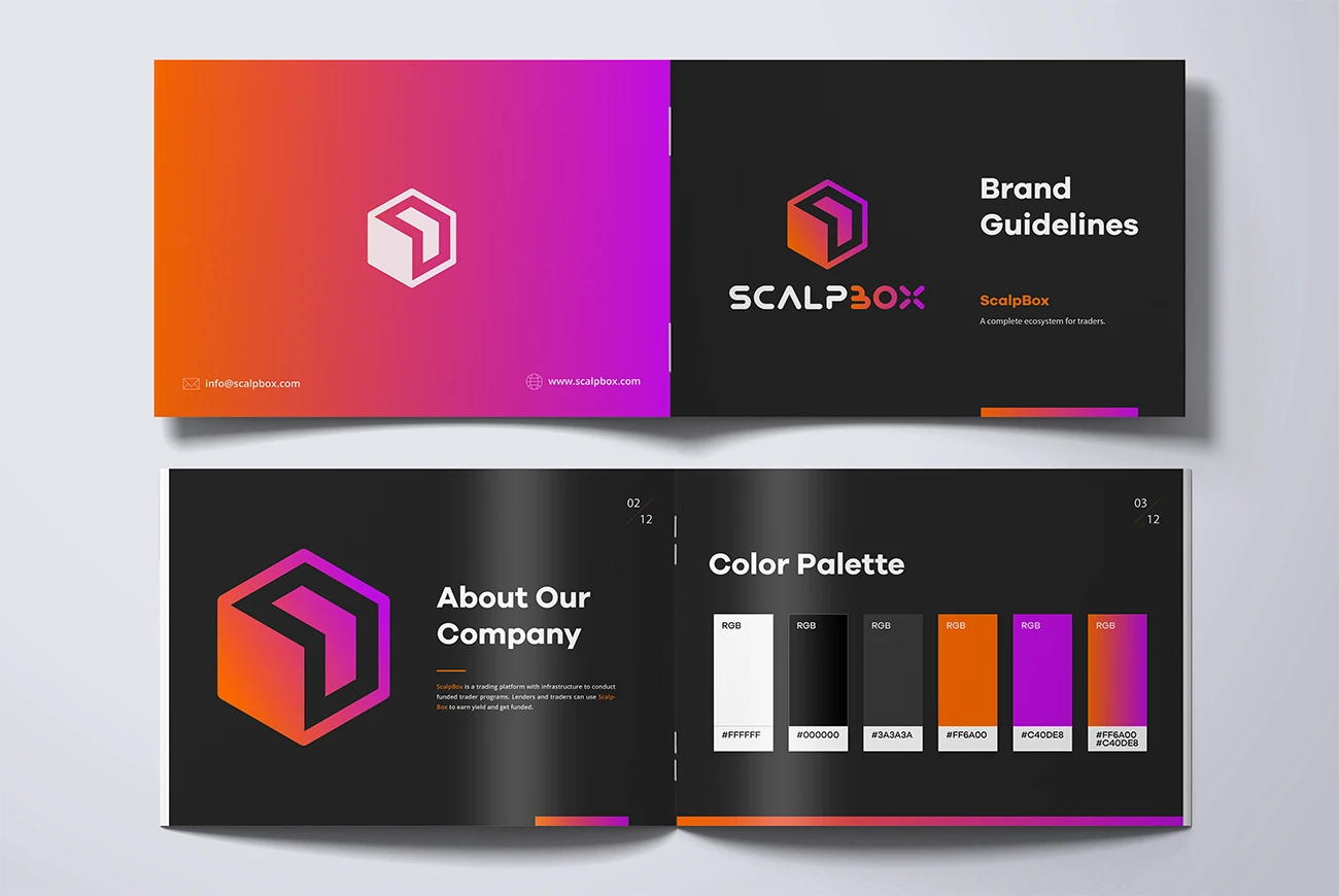
Gradients have been making a resurgence in recent years. Rather than relying on flat colors, brands are using gradients to convey depth, dynamism, and motion. By blending colors together, gradients can create unique visual interest, offering a sleek, contemporary feel. They are particularly popular in tech and creative industries.
Muted and Earthy Tones
As sustainability becomes an increasingly important value for modern consumers, muted and earthy color palettes are gaining traction. These colors evoke a sense of calmness, authenticity, and connection to nature. Brands in wellness, organic food, and eco-friendly industries have widely embraced this trend to communicate their commitment to natural, sustainable practices.
Monochromatic Palettes
Monochromatic color schemes focus on different shades of the same color, creating a cohesive, clean look. These palettes are perfect for minimalist brands, giving them a sleek, uncluttered appearance. Monochromatic schemes help create a harmonious visual identity that feels both modern and timeless.
Neon and Cyberpunk Aesthetics

Vibrant neon colors, often seen in futuristic cyberpunk themes, appeal to younger, tech-savvy audiences. This trend works particularly well in industries like gaming, entertainment, and tech. Neon accents can add a bold, edgy flair to your brand identity, making a strong visual statement.
Retro and Vintage Color Palettes

Retro-inspired palettes—think pastel pinks, mustard yellows, and teal—are gaining popularity with brands that want to evoke nostalgia. These color schemes can be perfect for brands that want to create a sense of warmth and familiarity, particularly in lifestyle, fashion, and hospitality industries.
Duotone Palettes
Duotone color schemes use two contrasting colors to create striking visual effects. They’re bold, memorable, and often used in logos, marketing collateral, and web design. This trend is ideal for brands looking to differentiate themselves with a simple yet impactful color strategy.
Trends in Color Usage Across Industries
Different industries tend to gravitate towards certain colors based on audience expectations and industry standards. Understanding these trends can guide you toward a palette that resonates well with your target market.

- Tech & Innovation: Blues, blacks, whites, and metallics dominate this space. These colors communicate trust, innovation, and simplicity.
- Retail & E-commerce: Bright and bold colors like red, yellow, and orange are often used to stimulate action and excitement.
- Healthcare & Wellness: Calm, soothing colors like green, blue, and soft neutrals are commonly used to evoke a sense of trust and relaxation.
- Food & Beverage: Warm, appetizing tones like reds, oranges, and yellows dominate, as they stimulate hunger and excitement.
- Fashion & Luxury: Black, white, and gold are staples in high-end fashion branding, symbolizing elegance and sophistication.
When choosing your brand colors, consider both what’s standard in your industry and how you can stand out from competitors.
Building a Balanced and Cohesive Color Palette for Modern Brands
Crafting a cohesive color palette isn’t just about choosing colors that look good together—it’s about creating a visual language that communicates your brand’s values, personality, and goals. A well-designed color palette serves multiple purposes, from setting the right emotional tone to ensuring that your design is both aesthetically pleasing and functional.
Establishing a Clear Color Hierarchy
The first step in building a cohesive palette is to define a clear hierarchy. In any design, colors need to have roles that serve different purposes, such as highlighting, complementing, or providing contrast. A common mistake is to use too many colors without assigning them specific roles, leading to visual clutter and confusion. Here’s how to build a strong hierarchy:
- Primary Colors: These are the core colors that define your brand’s identity. They are the most recognizable and will appear most frequently in your branding materials—logos, websites, packaging, etc. Typically, this consists of 1-2 dominant colors.
- Secondary Colors: These colors support and complement the primary colors. While they don’t overshadow the primary shades, they provide variety and flexibility, ensuring your design doesn’t become monotonous. These colors are often used in subheadings, buttons, or backgrounds.
- Accent Colors: Accent colors are used sparingly to create emphasis and guide user attention to important elements, such as call-to-action buttons, links, or promotional banners. These colors should stand out from the rest of the palette and draw the viewer’s eye.

The number of colors you include in your palette should typically range between 3 to 5, including primary, secondary, and accent colors. Any more than this, and you risk diluting your brand’s message, making it harder for users to recognize and remember your visual identity.
Achieving Balance: Contrast and Harmony
A successful color palette achieves balance between contrast and harmony, ensuring that your design elements are both visually engaging and functional.
- Contrast for Visual Clarity: High contrast between elements, particularly between text and background, is essential for readability. Contrast helps guide the user’s attention and establishes visual hierarchy. However, too much contrast can be harsh on the eyes and create unnecessary tension. Strive for contrast that creates clarity, especially for important elements like headings and CTA buttons, without overwhelming the user.
- Harmony for Aesthetic Appeal: While contrast is important, too much of it can result in a disjointed design. Harmony, on the other hand, refers to how well colors complement each other to create a unified look. Colors that are next to each other on the color wheel (analogous colors) or have similar tones work well together and create a sense of cohesion. A harmonious color palette makes a brand feel consistent and thoughtful.
To find this balance, consider the 60-30-10 rule, which is a popular principle in design:
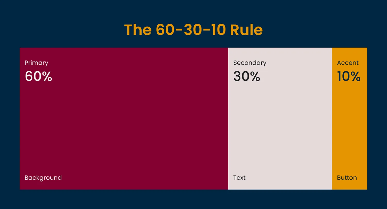
- 60% of your design should consist of your primary color.
- 30% should come from your secondary colors.
- 10% should be reserved for accent colors.
This ensures that no single color overpowers the design, while also keeping the user’s focus where you want it.
Psychological and Emotional Alignment
Colors evoke emotions, and it’s crucial to consider the psychological impact of your palette. Beyond mere aesthetic appeal, color choice needs to align with your brand’s core values and evoke the intended emotional responses in your audience. For instance, a brand that values innovation and creativity might use bold, vibrant colors like red or orange, while a brand that emphasizes calm and reliability might lean into blues and greens.
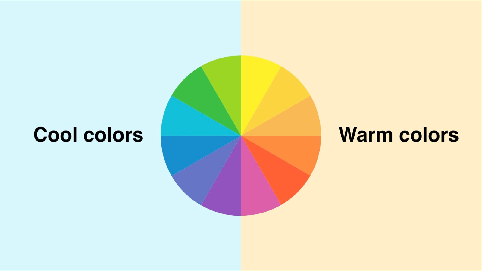
- Cool Colors (Blues, Greens, Purples): These evoke feelings of calm, trust, and professionalism. They’re often used in industries where brands want to convey reliability, such as healthcare, finance, or tech.
- Warm Colors (Reds, Yellows, Oranges): These stimulate energy, passion, and excitement. Brands in retail, entertainment, or food industries often leverage warm colors to capture attention and evoke a sense of urgency or enthusiasm.
- Neutrals (Grays, Whites, Blacks): Neutrals are often used to balance out a color palette, providing background or support to stronger colors. They can also be the primary tones in minimalist brands that prioritize simplicity and sophistication.
By carefully selecting colors that align with your brand’s emotional goals, you ensure that your palette is not only visually appealing but also speaks to the core identity of your business.
Color Combinations: Exploring Techniques
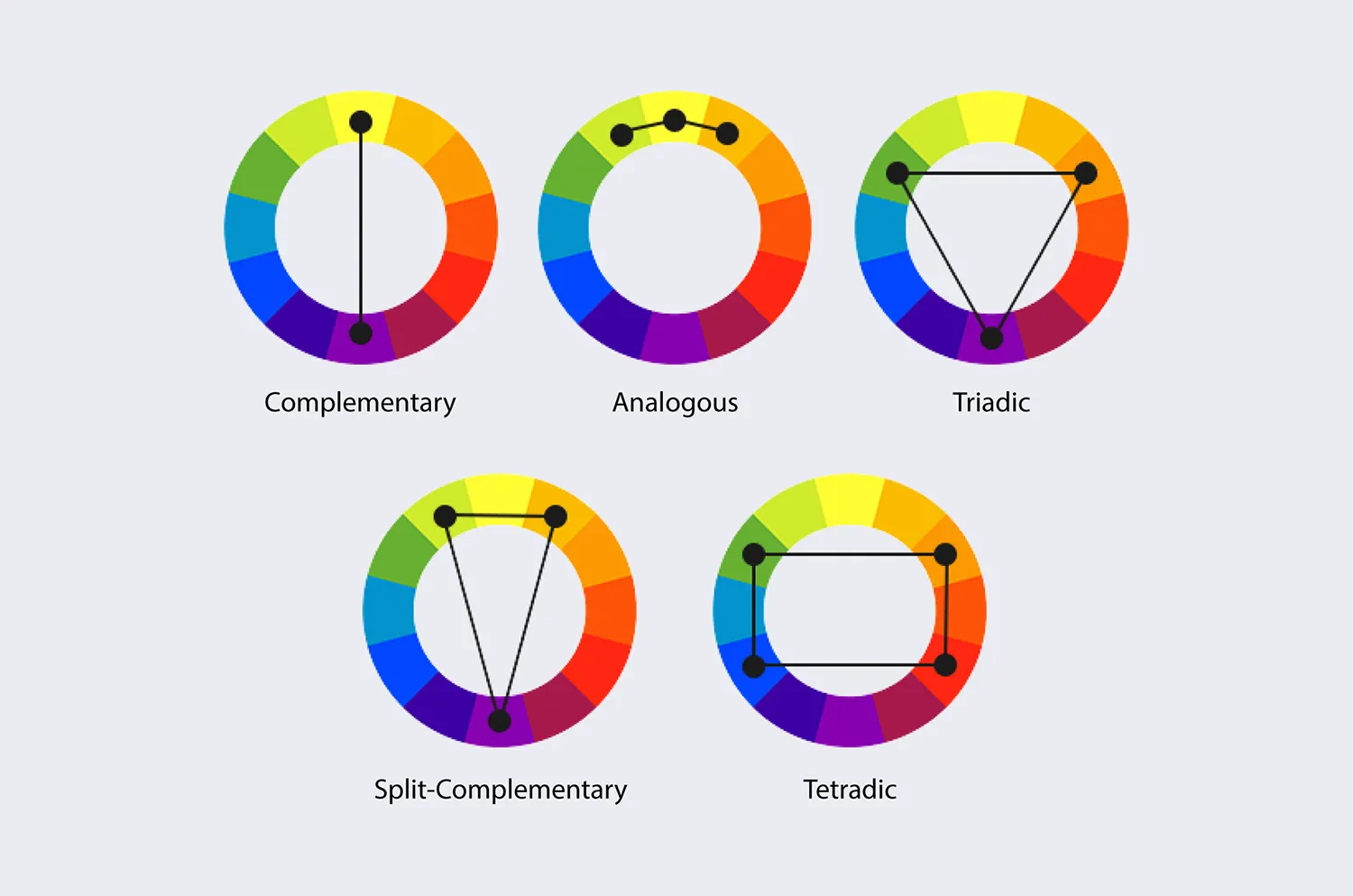
To create a cohesive and balanced color palette, there are several popular color combination techniques that can guide your decision-making:
- Monochromatic Schemes: This approach uses variations in lightness and saturation of a single color, creating a simple and elegant look. Monochromatic schemes can give a brand a clean and sophisticated appearance, helping reinforce consistency and uniformity. However, it may lack contrast if not used carefully, which can sometimes make the design feel flat or monotonous. To overcome this, brands often incorporate texture, typography, or varying tones to create visual interest while maintaining a cohesive look.
- Analogous Schemes: Analogous color schemes consist of colors that sit next to each other on the color wheel (e.g., blue, teal, and green). This type of palette creates a harmonious and visually pleasing effect. It’s calming and cohesive, making it an excellent choice for brands that wish to convey stability, unity, and tranquility. The similarity between colors fosters a natural, relaxing aesthetic, but designers must be cautious about adding enough contrast to avoid the design becoming too soft or understated.
- Complementary Schemes: Complementary colors are those that sit opposite each other on the color wheel (e.g., red and green, blue and orange). This type of palette offers strong contrast, which makes it ideal for brands looking to draw attention to specific elements like call-to-action buttons (CTAs) or key messaging. When used effectively, complementary schemes can add energy and vibrancy to the design, but overusing high-contrast pairs can create visual tension or fatigue. Brands can balance this intensity by using neutral shades to soften the impact.
- Triadic Schemes: A triadic color scheme uses three evenly spaced colors on the color wheel, such as red, yellow, and blue. This combination provides vibrant contrast while maintaining balance and harmony. Triadic schemes are ideal for brands that want to make a bold visual statement without overwhelming the viewer. The equal distance between the colors ensures a sense of balance and energy, making this scheme a good fit for brands that aim to appear dynamic and lively. However, moderation is key to prevent the design from appearing too loud or chaotic.
- Split-Complementary Schemes: The split-complementary color scheme is a variation of the complementary scheme. Instead of using two opposite colors on the color wheel, it uses one base color and the two adjacent colors of its complementary color (e.g., blue paired with orange-red and orange-yellow). This approach offers a strong contrast while softening the intensity that a standard complementary scheme might produce. It’s a versatile choice, balancing vibrancy with harmony, and it’s great for brands that want contrast without overwhelming the viewer. This palette can evoke excitement and focus while still feeling more natural and less jarring than a strict complementary scheme.
- Tetradic (Double-Complementary) Schemes: The tetradic or double-complementary color scheme uses two sets of complementary colors (e.g., blue and orange combined with red and green). This is the richest and most complex of all color schemes, offering a wide range of possibilities. Tetradic palettes allow for bold, vibrant designs, perfect for brands that want to be seen as playful, creative, or adventurous. However, the complexity of this scheme requires careful balance. Designers must ensure that one color dominates while the others are used to provide support, otherwise, the design may become overwhelming and confusing.
By experimenting with these different approaches, you can find a color palette that not only reflects your brand’s personality but also maintains a professional and modern look.
Testing and Iteration: The Key to Refining Your Palette
A color palette isn’t set in stone. It’s essential to test how your chosen colors perform in real-world scenarios, particularly in digital design where display settings and lighting conditions can affect how colors appear.
- A/B Testing: Test different versions of your palette with key audience segments to see which resonates better. This is particularly effective when experimenting with CTA colors, background tones, or key accent colors.
- User Feedback: Gather qualitative feedback from users on how they perceive your brand’s colors. Does your audience feel the colors align with your brand’s values? Do the colors enhance or hinder their user experience?
- Cross-Platform Testing: Ensure your colors look consistent across various devices, from mobile to desktop, and even in print if applicable. Digital platforms often display colors differently, and ensuring consistency across all platforms is crucial for maintaining brand integrity.
By incorporating feedback and refining your palette over time, you can continuously improve its impact and effectiveness, ensuring it stays relevant to both your brand and your audience.
How Colors Affect User Experience and Conversion Rates
Color and Accessibility
One of the most important aspects of choosing a color palette is ensuring that it’s accessible to all users. Not everyone perceives color in the same way, and it’s crucial to design for users with color vision deficiencies. Use tools like WebAIM Contrast Checker to verify that your text and background combinations are easy to read. Proper contrast ratios improve readability and enhance the overall user experience.
Conversion-Optimized Colors
Your CTAs are critical conversion points. Studies show that color can significantly affect click-through rates for CTAs. For instance, bright colors like red or orange often stand out, grabbing users’ attention and driving action. In contrast, subdued tones like gray or brown might blend into the background and reduce conversions.

To optimize conversion rates, test different CTA button colors using A/B testing to determine what works best for your audience and brand identity.
Common Mistakes to Avoid When Choosing a Color Palette for Modern Brands

Overusing Vibrant Colors
While bright, saturated colors can create a bold visual impact, overusing them can overwhelm users and detract from your brand’s message. For instance, having a website full of neon shades might cause visual fatigue, pushing users away instead of drawing them in. Stick to a balanced palette where bold colors are used sparingly to highlight key areas.
Overcomplicating Your Color Choices
It’s easy to fall into the trap of adding too many colors to your palette. A cluttered color scheme can dilute your brand identity, making it harder for users to connect with your message. Simplicity is often more effective, with a focused color scheme allowing your brand to stand out.
Ignoring Accessibility
Accessibility is a critical consideration in modern web design. Failing to consider users with visual impairments, such as color blindness, can alienate a significant portion of your audience. Ensure your palette is accessible by using tools like Color Oracle to check how it appears to colorblind users, and WebAIM Contrast Checker to maintain text readability.
Best Logo Fonts for Branding and Design in 2024
Useful Resources for Choosing the Right Color Palette for Modern Brands
Adobe Color
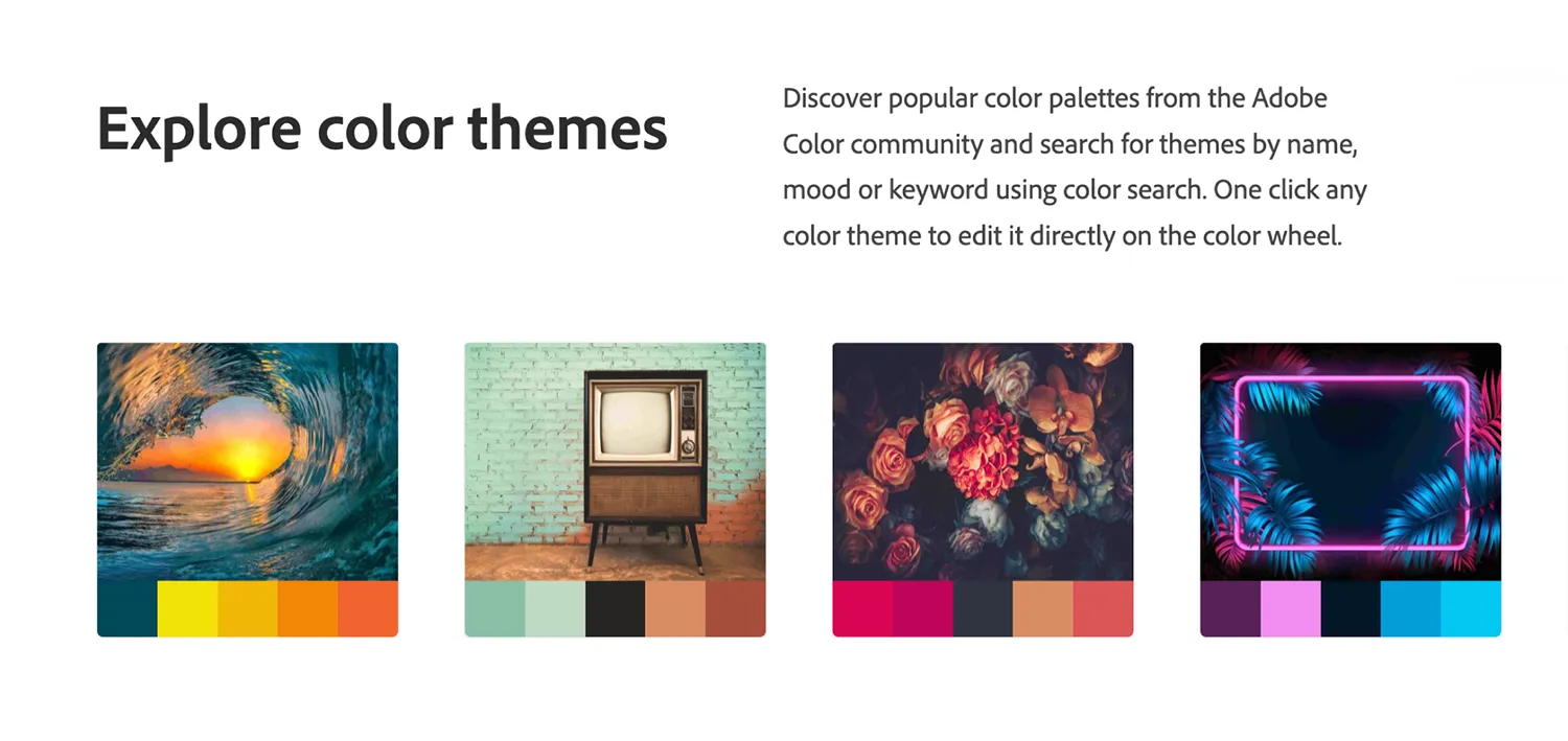
- Description: Adobe Color is a versatile tool for creating and exploring color schemes based on various color rules.
- How it helps: You can generate color palettes using harmony rules like complementary, analogous, or triadic schemes. Adobe Color also allows users to extract color schemes from images.
- Link: Adobe Color
Coolors (Our Favorite)
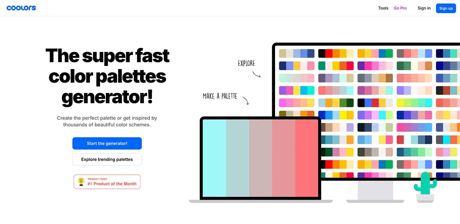
- Description: Coolors is a fast, user-friendly color palette generator that allows you to create, adjust, and export color schemes.
- How it helps: It offers a simple interface for exploring endless combinations and fine-tuning palettes, perfect for those who want a quick and easy solution.
- Link: Coolors
Colormind
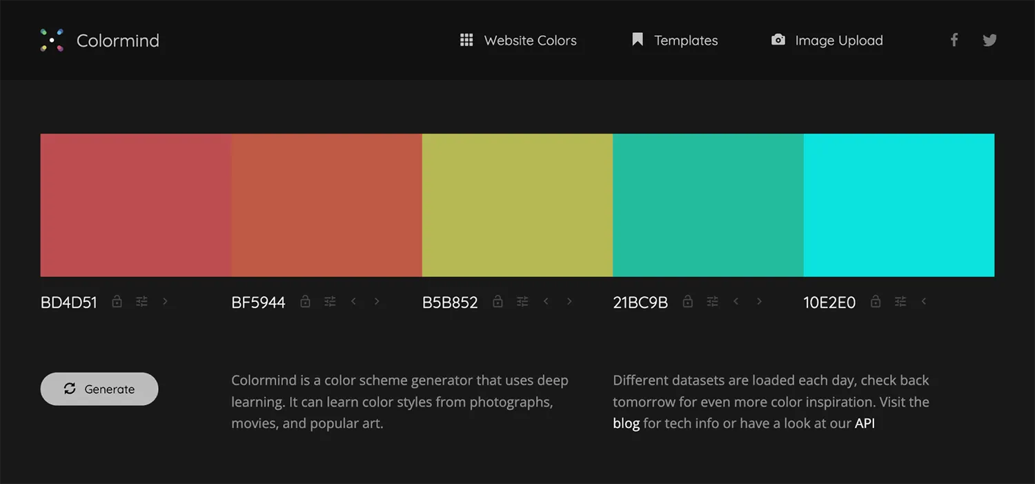
- Description: Colormind is an AI-powered color palette generator that focuses on creating stylish and modern color schemes.
- How it helps: The AI analyzes real-world images and user inputs to generate aesthetically pleasing palettes that are current with design trends.
- Link: Colormind
Color Hunt

- Description: Color Hunt offers curated, designer-made color palettes, making it a go-to resource for inspiration.
- How it helps: Browse through thousands of trending palettes to find the one that matches your brand’s style.
- Link: Color Hunt
How to Test and Refine Your Color Palette
Gathering Feedback from Users
Before committing to your color palette, gather feedback from users and stakeholders. This will help you gauge their reactions and see if your color choices align with your intended brand message. Simple methods such as user surveys or A/B testing can provide valuable insights into how well your palette works.
Revising and Adjusting Based on Results
Color schemes should evolve with your brand and audience. Be open to adjusting your palette based on the feedback and performance metrics you gather. For example, if users find your CTA buttons difficult to notice, tweaking the accent color could lead to higher conversion rates.
Conclusion
The colors you choose for your brand can make or break how it’s perceived by your audience. By applying color psychology, balancing your palette, and avoiding common pitfalls, you can create a color scheme that resonates with your target audience, enhances user experience, and strengthens your brand identity.
For expert guidance on branding, design, and web development, get in touch with 6 Degrees — we’ll help you make informed color decisions that elevate your brand to the next level.


